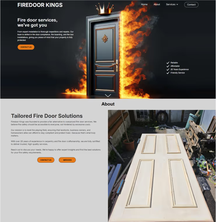

As the client had no logo or website for their business.
They requested an rasterised logo regardless of my dutiful notification of the downsides.
Later the client requested a simple ‘business card’ website, made quickly.
This project was more development-based than design-based.
Let’s Talk
Create a
rasterised
,
eye-catching, image-only
logo. Keeping within the 3 simple words ‘Fire’, ‘Door’, ‘King’. Create a website to give the client an online presence and enable customers to see their services and reach out to them.
Develop a website simple quickly
Increase incoming phone calls and emails
Gain meaningful online presence for searchability
Cater to commercial and private property owners
Write copy to set client expectations for each service
The client unwaveringly requested a rasterised format rather than vector graphic, though I dutifully informed the of the downsides to this.
Keeping within the simple 3 words ‘fire’, ‘door’, ‘king’ the logo approved art direction was a flaming door with a crown. Using AI tools I eventually sculpted the correct prompt, and extended the image to account for multiple formats.
The client requested a no thrills website. Simplicity with bold colours and contrast. This website demonstrates development more than design.
The client wanted ‘their business card, but online’.
and I adhered to this as much as possible while applying UI/UX principles, and I explained that the website will be more fleshed out to perform it’s function.
The client had little to no digital assets and was not willing to take more, thus I sourced stock images where needed.