
Great Websites. Quality Uncompromised.


As the simulated client already had branding and copy in place, this case study will show how I adhered to the brief, designed the logo and made design decisions for each section.
Let’s Talk
Create a website design that should feel organic and earthy, reflecting our eco-friendly mission, yet professional and modern. Tone: Down-to-earth, friendly, and reliable. Target Customers: Homeowners and small business owners aged 30-50, seeking professional landscaping and gardening services to improve their property’s outdoor spaces.

Convey branding through web design
Explore art directions
Drive incoming sales

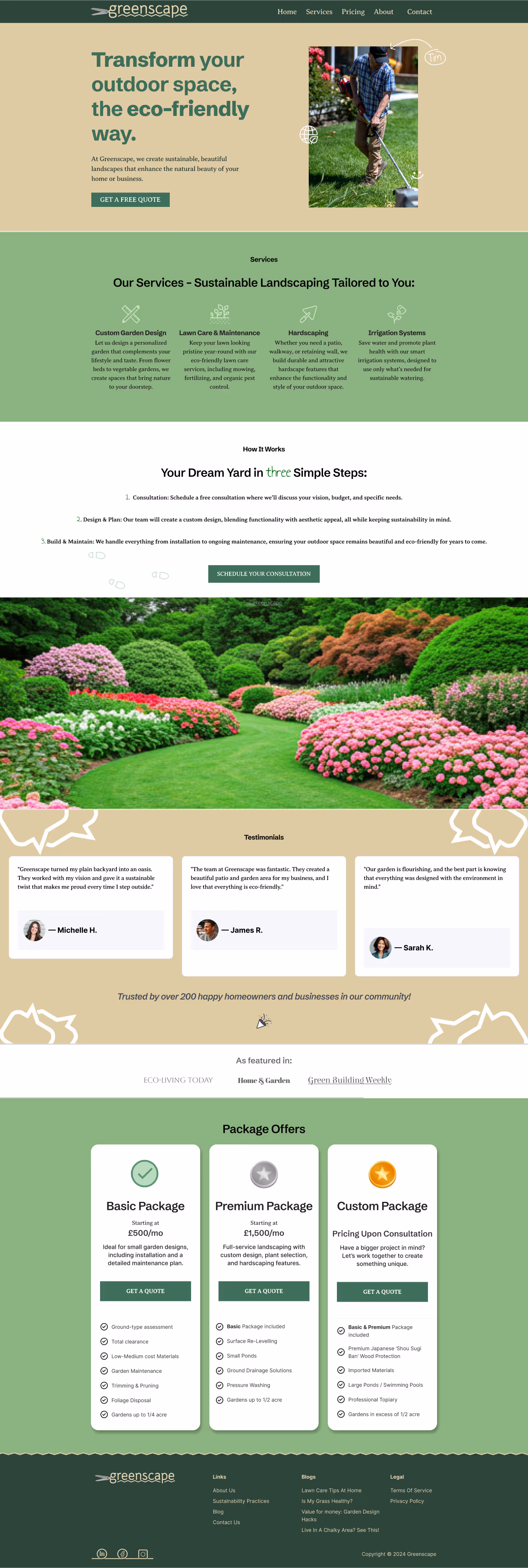
The Hero section features an employee, with a name and smiley face to communicate the friendly tone.
Hand drawn eco-graphics impart the organic and eco-friendly mission, and the professional design to give off professionalism.
The minimalist web design style checks the modern box.
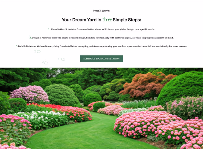
To relate to the target customers, individuals who fit into the same demographics were selected for the featured testimonials.
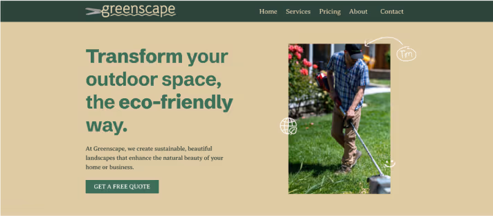
I exploited the copy’s natural pyramid structure in centre alignment to add variety, while the user automatically knows where the start of the next line of text is.
Following this I re-used the ‘three steps’ as boot graphics to subtly persuade the user to the CTA button.
Everything to do with three is green and handwritten/drawn for the organic and friendly vibe.
This is to style the section cohesively.
The beautiful image below then demonstrates an example of what the end result of these three steps could look like for the user.
I used conversation bubble background graphics to immediately convey the purpose of this section, reducing cognitive load, and give a down-to-earth vibe.
The partyu popper graphic adds to the friendly vibe
Let’s Talk
Great Websites. Quality Uncompromised.
Copyright © 2025 Shan Web Design
Privacy & Terms