
Great Websites. Quality Uncompromised.

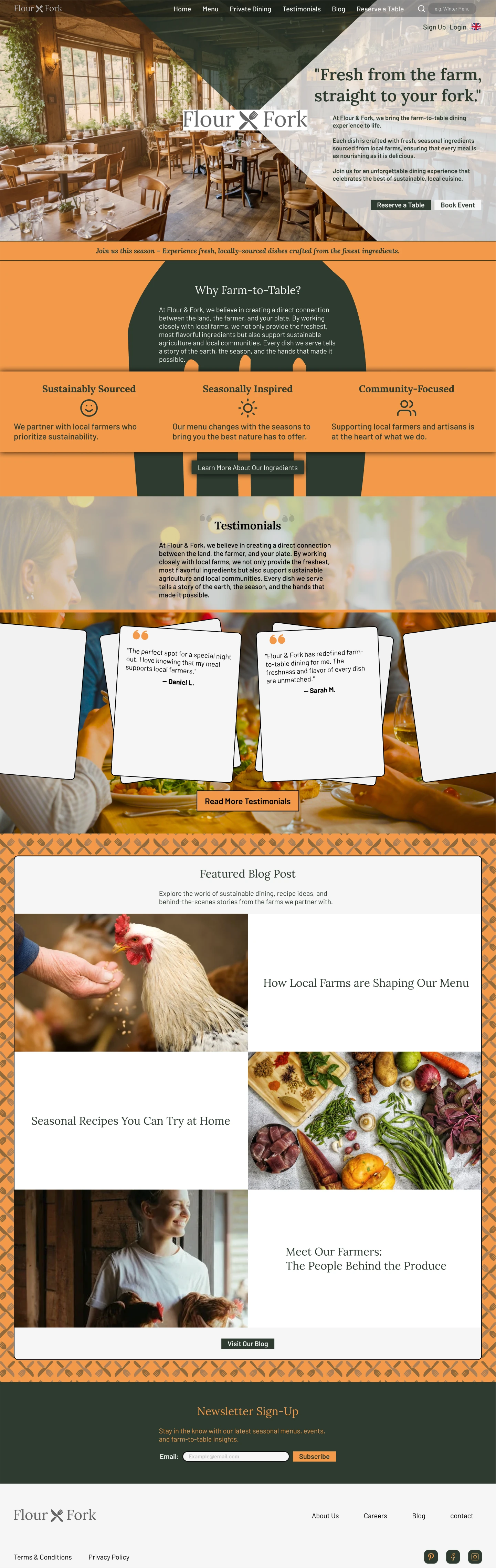
As the simulated client already had branding and copy in place, this case study will show how I adhered to the brief, and made design decisions for each section.
Let’s Talk
Create a
welcoming
,
community-focused
website for Flour & Fork, a farm-to-table restaurant that emphasizes
seasonal
,
locally-sourced ingredients
. The design should evoke a sense of
warmth
, while highlighting the restaurant’s
commitment to sustainabilit
y,
fresh ingredients
, and
culinary craftsmanship
.

Drive table reservations and event bookings
Promote private dining and special event services
Establish Flour & Fork’s reputation as a leader in the farm-to-table dining experience
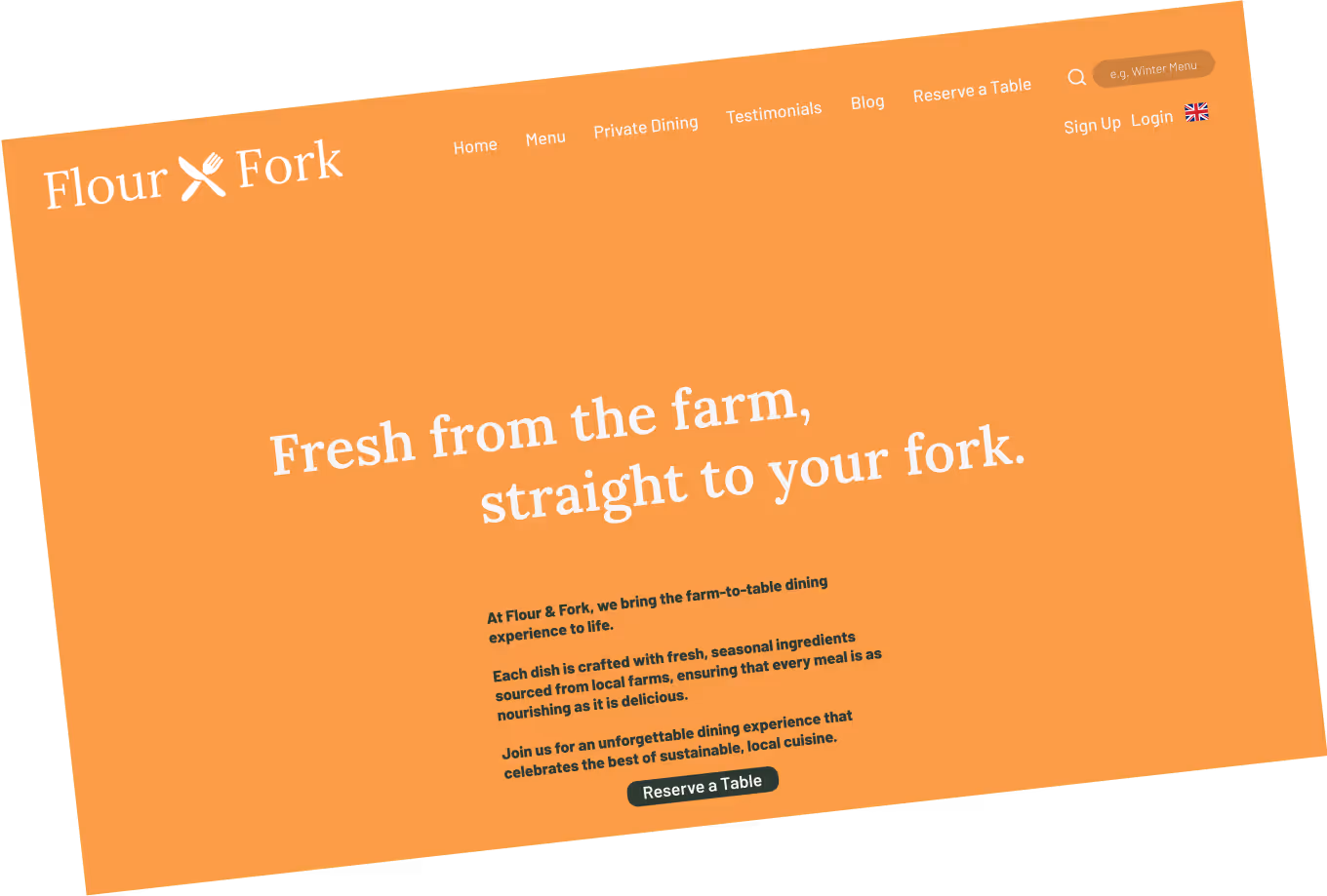
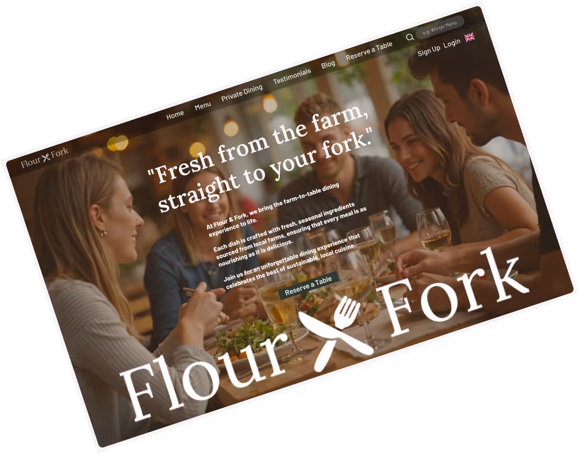
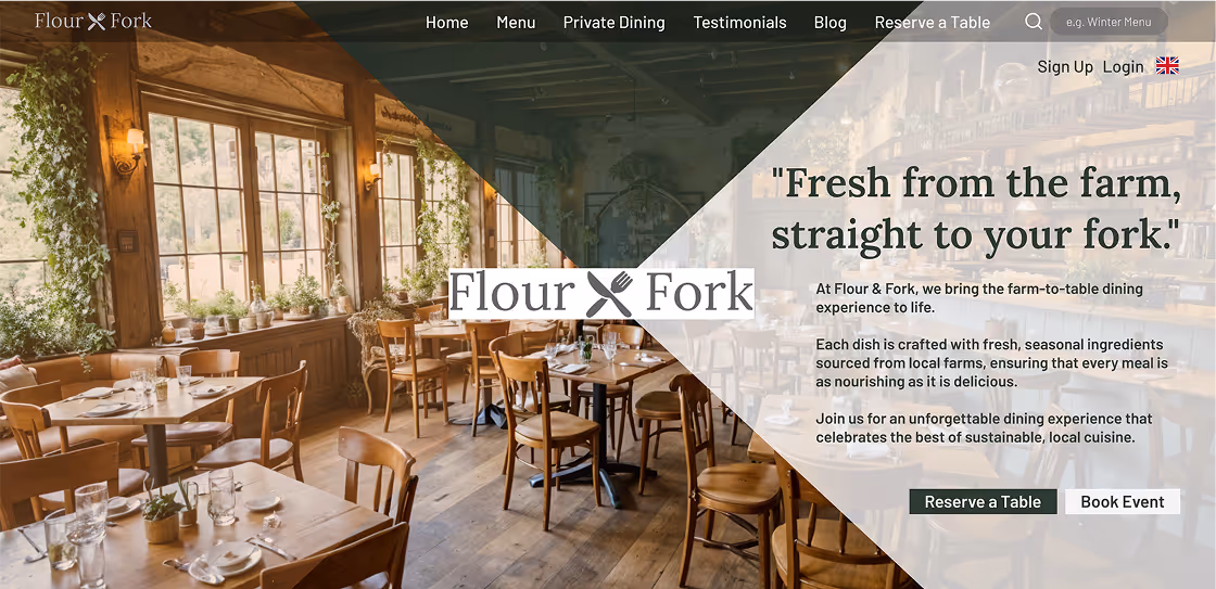
After experimenting it became clear the hero section needed to show the location, as ultimately the first message visitors need confirmation of is that this is a restaurant.
Hover to see current Hero section
Using the logo, I created a visual hierarchy lead the user’s eye to the centre first, then using white to lead the eye to the copy, and finally allowing the eye to wander left - using the brand colours I subtly overlaid translucent orange, giving the impression of
warmth
to the restaurant
.
Both of the hero CTAs have been utilised to implement the primary objective of driving table reservations and event bookings.
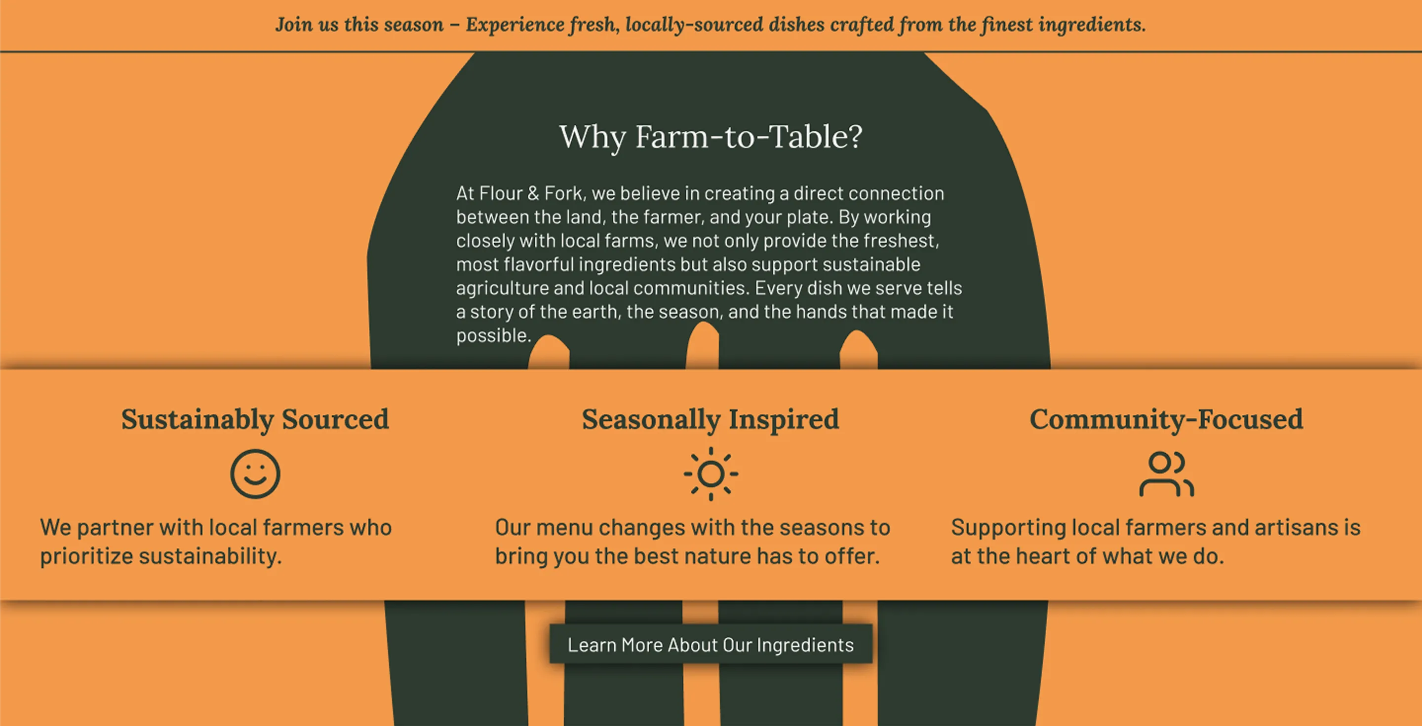
The objectives have already been communicated - but it is important for a cohesive design to continue with consistency, reiterating the message of flour & fork throughout the website.
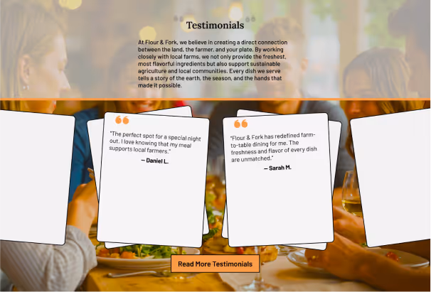
Hover to see current Testimonials section
The testimonials sections is a great section to target
welcoming
and
community
.

Simple cross patterns are found in organic settings - wicker baskets, burlap sacks, traditional picnic blankets. I experimented with the logo to create a background asset. These all have
sustainable
connotations.
Hover to see current Blog section
The background contrast was too high. To create less user attention I decreased opacity. in order to make the design more cohesive I brought back to 2px stroke width around this section.
Keeping it simple here.
Brand colours, this composition worked best, using white for high contrast so the section gets attention.
Let’s Talk

Great Websites. Quality Uncompromised.
Copyright © 2025 Shan Web Design
Privacy & Terms